Penguin Galaxy
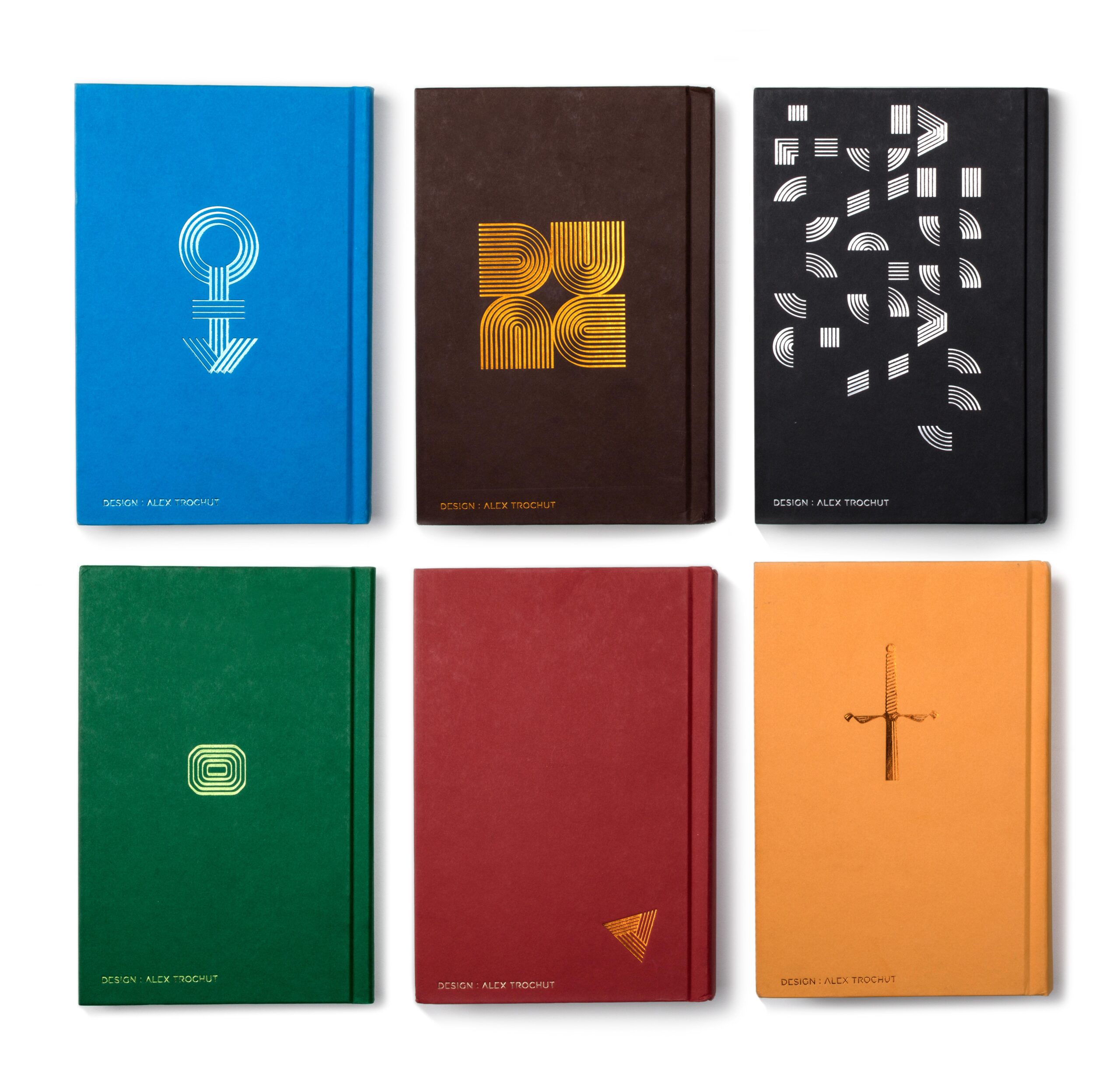
Design for the 6 Penguin SciFi classics. The brief consisted on a sctrictly typographical approach, creating a consistent style throughout the whole serie, from the shortest title “DUNE” to the longest “The Left Hand of Darkness”. Although this wasnt a system per se, it demanded that decisions were not made on a full custom context on each book, but thinking as a serie.
Client: Penguin Classics
Creative Direction: Paul Buckley
Country: USA
Year: 2016
Neuromancer by William Gibson
William Gibson created the concept of “Cyberpunk”. The future that Neuromancer pictures isn’t clean or sleek, its low key and obscure, mutated into a hybridisation of all kinds,… The glitch aesthetics is a good way to capture this mix between human and machine, physical and digital, humanising the machines and mechanising humans. making a hybrid of both. The typography has a technology nostalgia approach using the colors of an old screen.
2001: A Space Odyssey by Arthur C. Clarke
2001 A Space Odyssey is a timeless enigma that raises questions that scape the human comprenhension, therefore the front cover plays with the idea of a solving game with the reader. The backcover teases the reader even more to decipher an imposible group of modular pieces that belong to the front cover. This lettering forces the reader to solve a 2 seconds solving game, who needs to turn around the cover 90 degrees in order to read it.
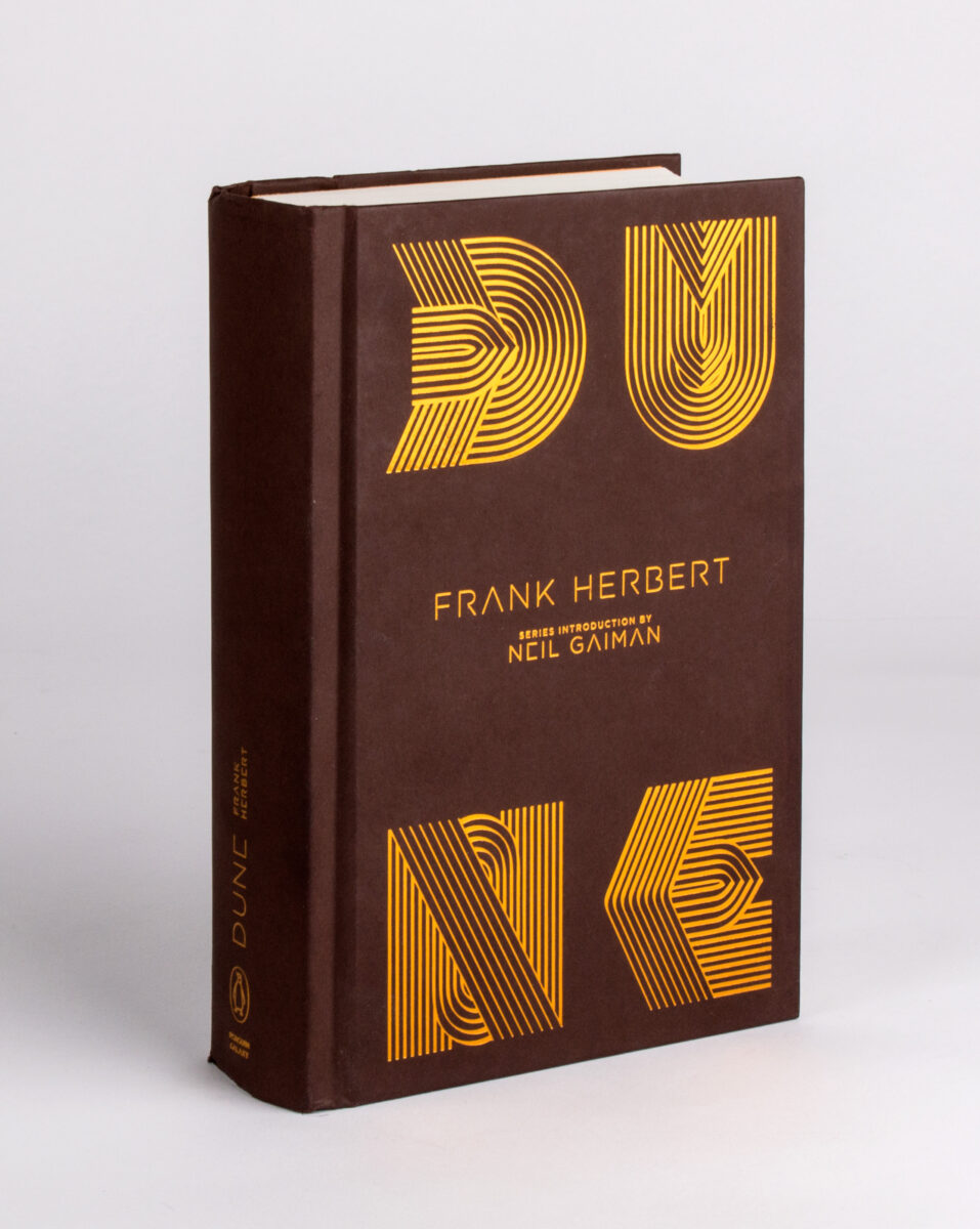
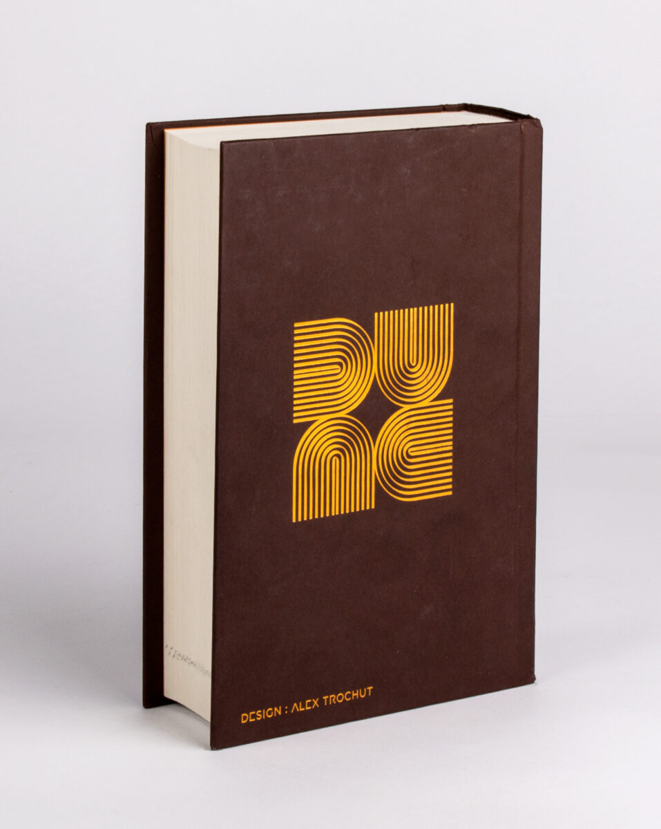
Dune by Frank Herbert
An intricate political story of emperors, dukes and barons. Futuristic but with the same ingredients of a medieval epic story. The lettering has a hint of Egyptian jewerly designs inspired by the desert.
DUNE is, as a word, a quite special puzzling structure of letters that allow to read 4 different characters by simply rotating 90 degrees the “D” shape. I thought this logo, in some way, speaks of the strategic nature of Arrakis, a planet where different parts intersect from different points of view and interests. This design is going to be used in the back-cover.
The Once and Future King by T. H. White
Following up with the line style, this book cover is the result of merging the line style of the collection with a medieval style lettering.
The icon of the sword is on the back, appearing half of it hidden, referencing the sword in the stone.
Stranger in a Strange Land by Robert A. Heinlein
The concept is based on the crash of perceptions based on behaviours, traditions, religions,… that the book expresses in the differences between Mars and Earth.
The words “Stranger in a” appear facing an oposite directions as “Strange Land”, comfronting the subject and the context.
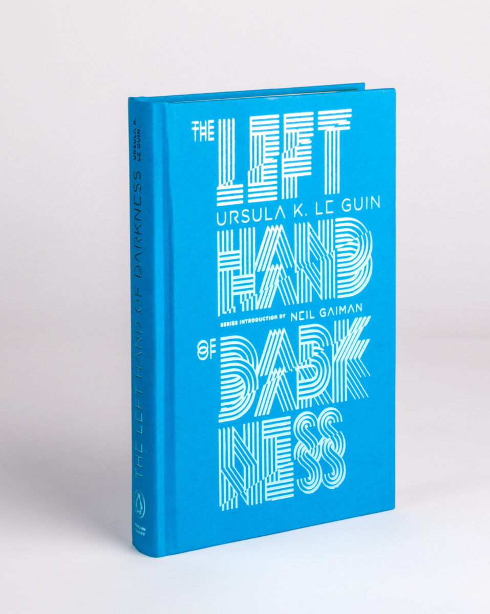
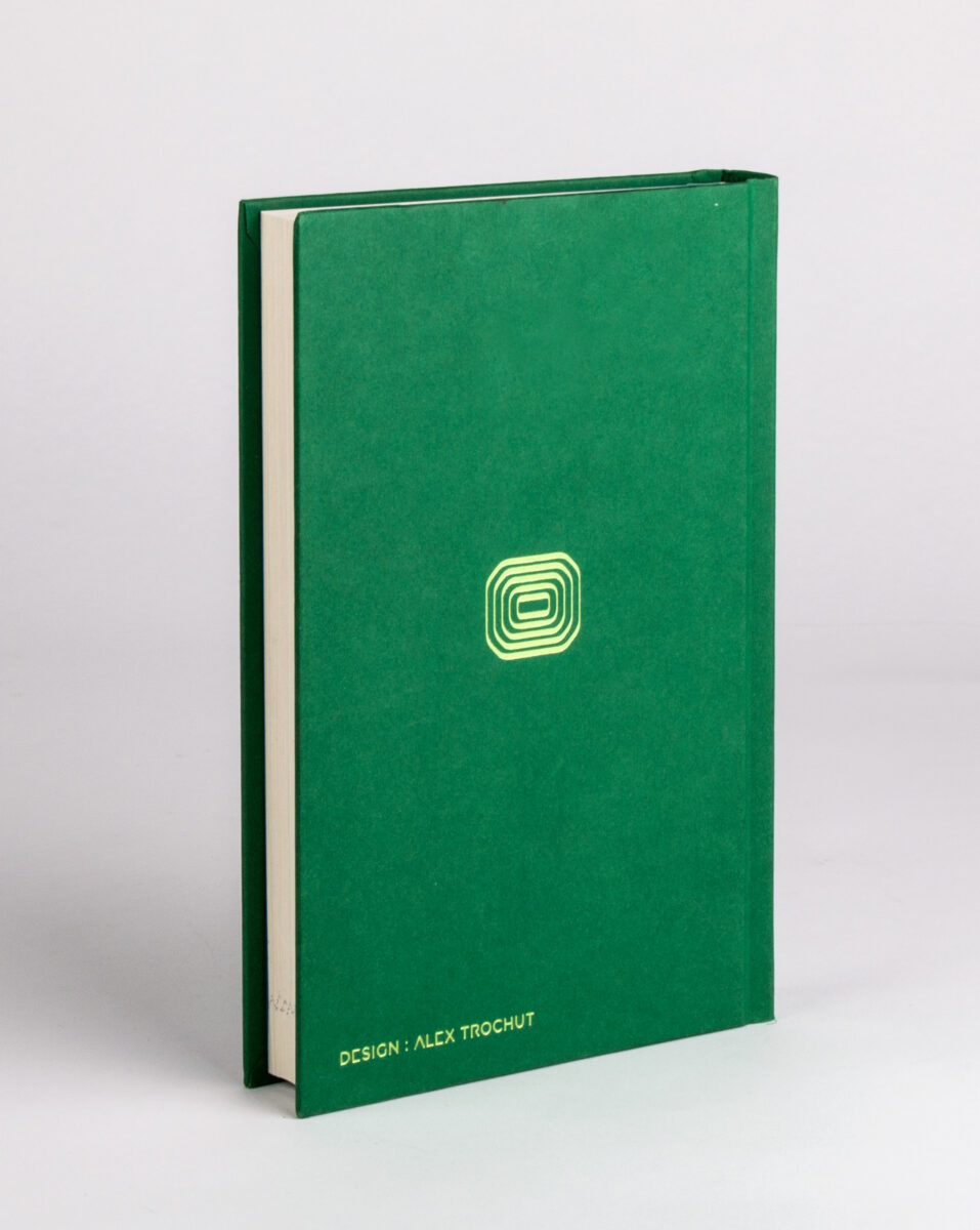
The Left Hand of Darkness by Ursula K. Le Guin
Focused on Gethen (the frozen planet) and its androgynous society, these letters are duplicated and transparent, inducing to interpret as ice and the duplication of the same type of gender.
On the backcover we see the androgyne symbol.